Storage.com
User Experience , User Interface, Web App
Project Overview
Storage.com is a platform for finding storage units nearby. The goal of the project was to redesign Storage.com’s search results page to achieve a streamlined experience that was easy to scan, user-friendly, and optimized for conversions.
Challenge
My Contributions
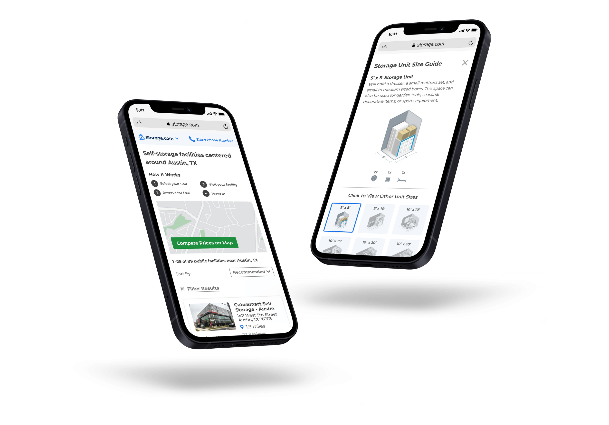
As this was a redesign of an existing search results page first step was to analyze the current search results page. I worked with one more designer, and we took the mobile-first approach since 70% of the users used the website on their mobiles. After solidifying the mobile experience, we worked on a desktop redesign.

The most important part of the project was to maximize the small space available on the mobile device and display all the essential information about different facilities. The page needed to be simple, yet have all the necessary information clearly laid out at-a-glance.

Storage.com search results page: Before & After
Solution
We opted for a card layout to display all the facilities vertically to maximize the space. The goal was to display all the features of the facility as well as the pricing and have access to reserve the unit from the card itself. We also added a “call to book” link right into the card so that the user can find everything at-a-glance.

Iterating along the way
One of the important features was to have all the facilities displayed in the map view based on the location input. This would allow the user to easily view all the facilities near them.

What’s Next?
Storage.com team have implemented the design and is now live!
Storage.com team have implemented the design and is now live!